Donut chart
The donut chart shows the same information as the box score. However instead of using plain numbers in a table the values are plotted in beautiful charts.

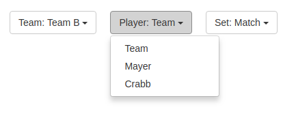
You’re able to filter between the two teams, single players and individual sets. By using animated transitions it is easy for you to spot even tiny differences in the data set. Use your mouse and move over the chart to get additional information for each slice. Move it over the legend to quickly highlight the corresponding area of the chart.